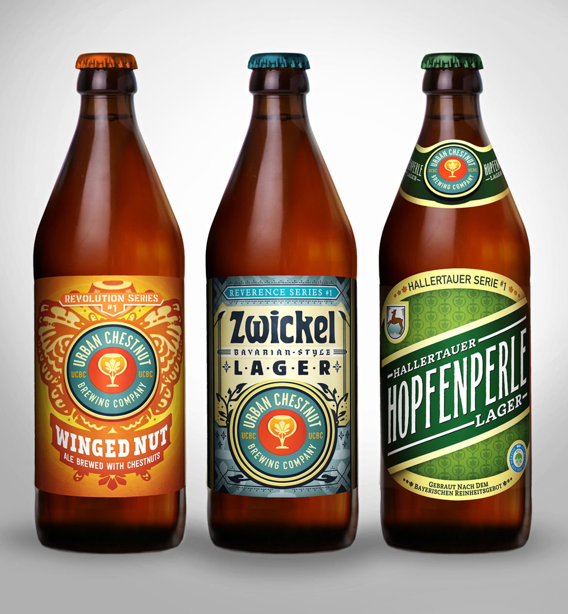
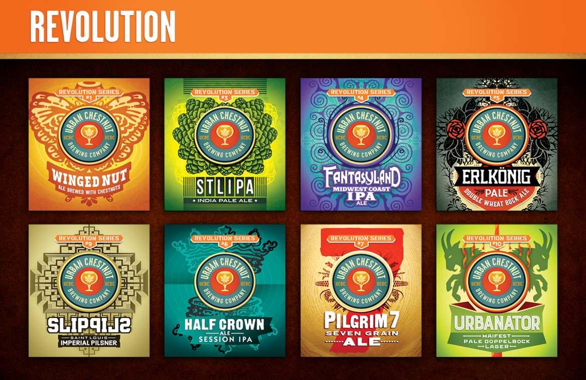
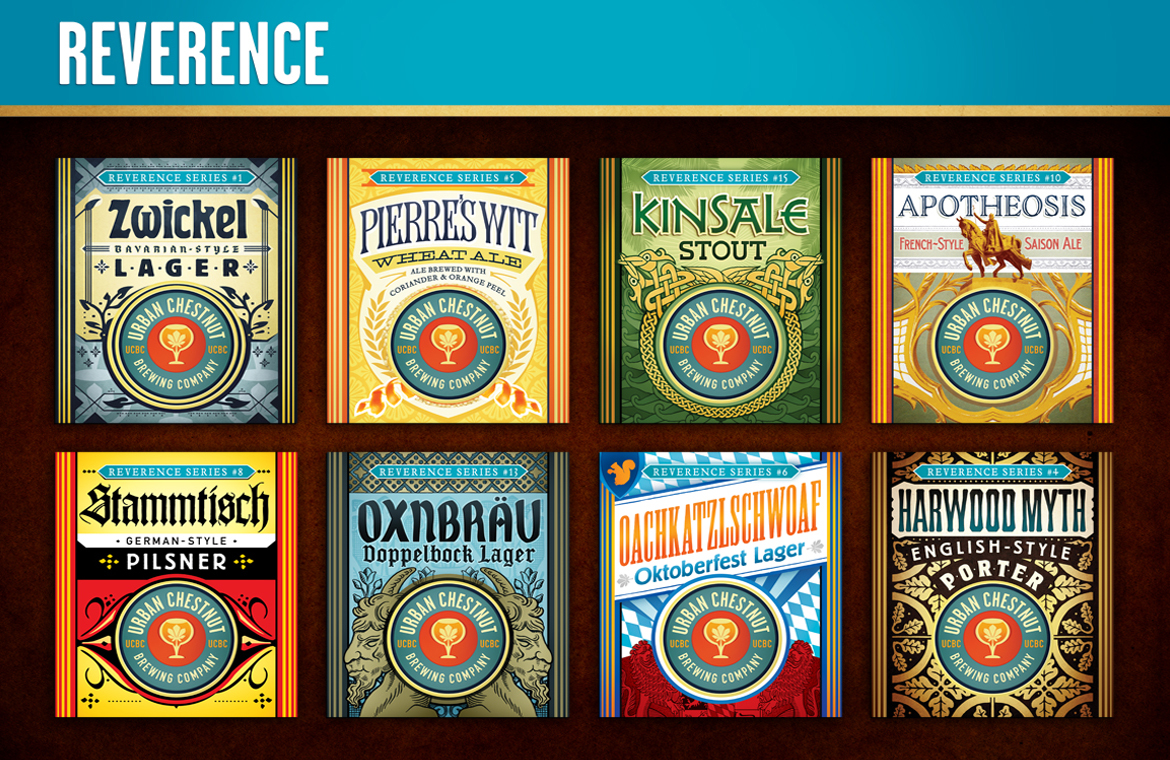
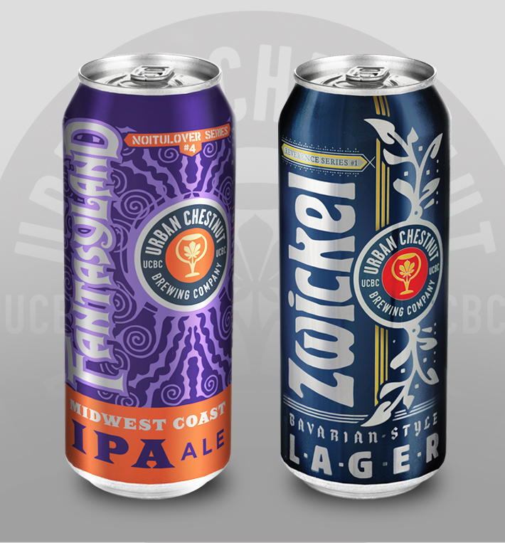
Urban Chestnut has two distinct series of beers in the U.S. - the Revolution Series, which is dedicated to creating modern American-style craft beers, and the Reverence Series, brewed in the style of classic European beers.
So when Marketing28 started collaborating with UCBC on creating a label look there was a strong desire to make sure each series felt like it was coming from the same brewery, but each series also needed to have it own design rules, too.
It's Two-Two Designs In One!
So What are the differences? For the Revolution Series the main image bleeds left to right creating an open, modern feel to these labels. The UCBC logo is placed slightly higher than center, and the name appears under it.
Each Reverence Series label places the UCBC logo towards the bottom center with the name above. Another design distinction is the fact that the main facing area is surrounded by darker bands of color, creating a staging area for branding while achieving a bit (just a bit...) of an older-school design feel.
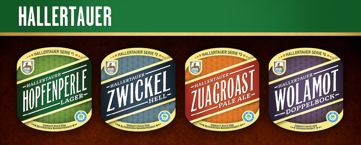
The Hallertauer Series
Another series of beers (or, should we say- 'biers') comes from Urban Chestnut's Hallertauer Brauerei in Wolznach, Bavaria. When we set out to create this series, it was imperative that we keep a feel of tradition, but also be true to the fact that these beers would be coming from an American brewery, albeit one that has a native German as the brewmaster! These bottle labels have more traditional oval shapes and also neck labels. If you get a chance to stop by we encourage you to lift a stein and say "Prost!"